Big Sky Town Center

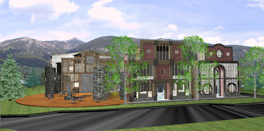
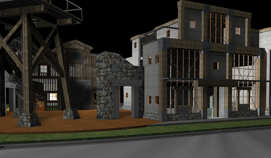
The Water Tower Courtyard. Rather than designing a building and then landscaping around it, I started by looking at making a pedestrian area first, a corner separation where people can move through a special place between the buildings, a semi-protected courtyard that would be a natural meeting place – “I’ll meet you at the water tower . . . “. This courtyard would be far enough off the street that your napkins wouldn’t blow away when cars went by but still connected enough to be part of the ebb-and-flow action on the street. A stair would spiral up into the “tank” and there would be a door there to let people out onto the platform. There would be a hatch at the top of the stair to lock it off when necessary. This area could easily be used for plays or even have a large outdoor screen set on the tower. Up to four good-sized venues could have direct access to the courtyard. Much of the pedestrian traffic from the parking area heading toward the neighborhood commercial area to the west would funnel through this space. Pedestrian traffic along the main street would likewise be drawn in. The tower also reacts to a tall square portion of the building across the road. It would be very visible from both the highway and from the intersecting road. Deteriorating stone walls encompass the outdoor area and pull the buildings into one synergetic composition.


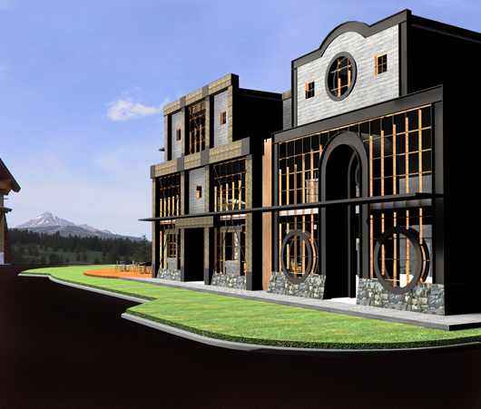
The Town Center Avenue ‘Buildings’.The Town Center Design Guidelines and Standards state “New interpretations of traditional building types are encouraged”. The false front was historically developed as a little-disguised method of making an establishment appear more substantial than it really was. It of course ended up creating its place in architectural lore, but recent take-offs of this feature often seem to fall short in their allusion to the original fabrication. In this case I went with the premise that if we are utilizing an element that was originally false, then some fun should be had in its present incorporation. The spandrel infill panels permit optimal display area while also allowing light to penetrate deep into the 2nd floor office spaces. The residential area above is stepped further back and has openings in its more public spaces but plenty of wall space for the more private areas. The view out the curved glass wall on the west side of the residence would look over the courtyard and livery directly toward the mountain views. The building should really try to look like two separate stores, not part of a strip with separate fronts put on. A vertical plank “barrier” is placed between them, as if blocking off the interstitial space. This would be an ideal location for a small lobby, stair and elevator, either on the back side or the front. The “two” buildings want to have individuality, but yet play off each other. One has a heavy timber front, the other a more sexy gunslinger-like metal facade. Both use these solid elements to emphasize the light, transparent nature of the infill glass. The east side of the building is also given store-front level attention, though this would be of a more solid nature with more conventional wall openings. The breaking-up of the overall mass produces a building that has appropriate street presence but maintains a proportional variation, keeping it from becoming overly cumbersome or ominous. Structure is intriguingly used as structure and not as decoration.

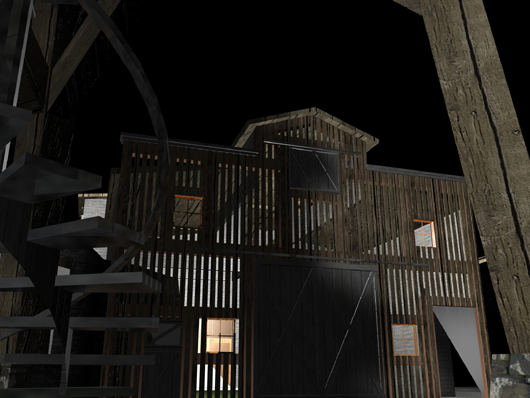
The Livery.Typically located on the periphery of downtown, the stable offers a wonderfully simple form to add to the courtyard experience. Gap-sided in the fashion of a hay barn, with glass walls behind, this building can become a light-infused interior space while preserving the more closed-off exterior look of a traditional livery.In essence, since we are manipulating these traditional forms for modern purposes, there is a fair degree of something like stage design incorporated. Rather than making a gesture toward imitating history, we take steps to utilize these forms to create deliberate new spaces.